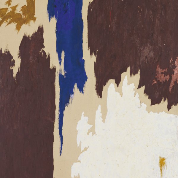
Untitled (Green on Maroon)
Despite the fact that Rothko is associated with the Abstract Expressionists, his paintings do not share the gestural, spontaneous character of their work. In Rothko’s later canvases, one or more rectangular fields of colour appear to float over the background surface, yet never stand out fully from it. His vibrant colours, applied in successive highly-diluted layers, envelop the viewer, who is drawn into a new spatiality that resists any attempt at measurement. In the 1950s, the bright, expansive colours of his earlier work gradually gave way to darker, more introspective hues; maroons, greys, dark greens and browns. This painting is a superb example of what the critic Robert Rosenblum termed Rothko’s ‘abstraction of the sublime.’
Although he is generally associated with the generation of Abstract Expressionist painters of the New York School, Mark Rothko very soon broke away from his colleagues’ gestural, spontaneous style of painting. By the early 1950s Rothko had developed a personal abstract language which he continued to refine and simplify throughout the following twenty years. His canvases, which are generally large — as he believed they would inspire greater intimacy when viewed — are divided into several rectangular, more or less horizontal, open and vibrant fields of colour which bear no relationship to geometry and appear to float in an indeterminate space. The paint, applied in a series of thin layers, as if it were watercolour instead of oil, never reveals the brushstrokes, and texture is reduced to its minimum expression.
Rothko conceived his works as dramas, as the performance of a timeless tragedy. His paintings, infused with great spiritual intensity, engage the viewer with great emotional force, inspiring contemplation and meditation. Robert Rosenblum described Rothko’s painting as “abstraction of the sublime” and related it to the Romantic tradition of the northern European countries. According to this author, Rothko’s paintings, like those of Friedrich a century before him, “look for the sublime in a profane world.”
Rothko considered pure colour to be the best means of expressing emotions, and in this respect he can be linked to Kandinsky’s mystic theories of abstraction. Like Kandinsky, Rothko believed that colour acted directly on the human soul and was capable of eliciting deep emotions in the viewer. During the early 1960s, the bright, powerful tones of his earlier paintings, which have a sort of expansive radiating effect, were replaced by dull shades of maroon, grey, dark green and brown, resulting in more hermetic and even more awe-inspiring works.
In 1961, the same year Rothko painted the Green on Maroon belonging to the Museo Thyssen-Bornemisza, The Museum of Modern Art held a major exhibition of his works, the first one-man show it devoted to an artist of the New York School. Rothko, who always painstakingly supervised the installation of his works, as he attached great importance to how the viewer approached them, created a very intense, dramatic display, placing the paintings very close together with very diffuse lighting. This heralded the change that was taking place in his work and was a faithful reflection of his depressed state. Although it is not known for sure, Gail Levin points out that Green on Maroon was most likely executed after the exhibition ended and is probably one of the first examples of the shift in Rothko’s painting towards duller and more opaque tones.
Jeffrey Weiss mentioned the contradiction between the appeal of Rothko’s painting, which lends itself to being viewed at length, and how difficult it is to decipher. Paradoxically, Rothko always aspired to be understood, convinced that “the evolution of the work of a painter is a journey in time towards clarity, ” that is, towards “the elimination of all obstacles between the painter and the idea, and between the idea and the observer. For Rothko, “to achieve this clarity is, inevitably, to be understood.”
Paloma Alarcó
Emotions through art
This artwork is part of a study we conducted to analyze people's emotional responses when observing 125 pieces from the museum.